Marathon Jam - July 2021
THIS DEVLOG CONTAINS SPOILERS. PLEASE PLAY THE DEMO BEFORE READING.
The Backstory
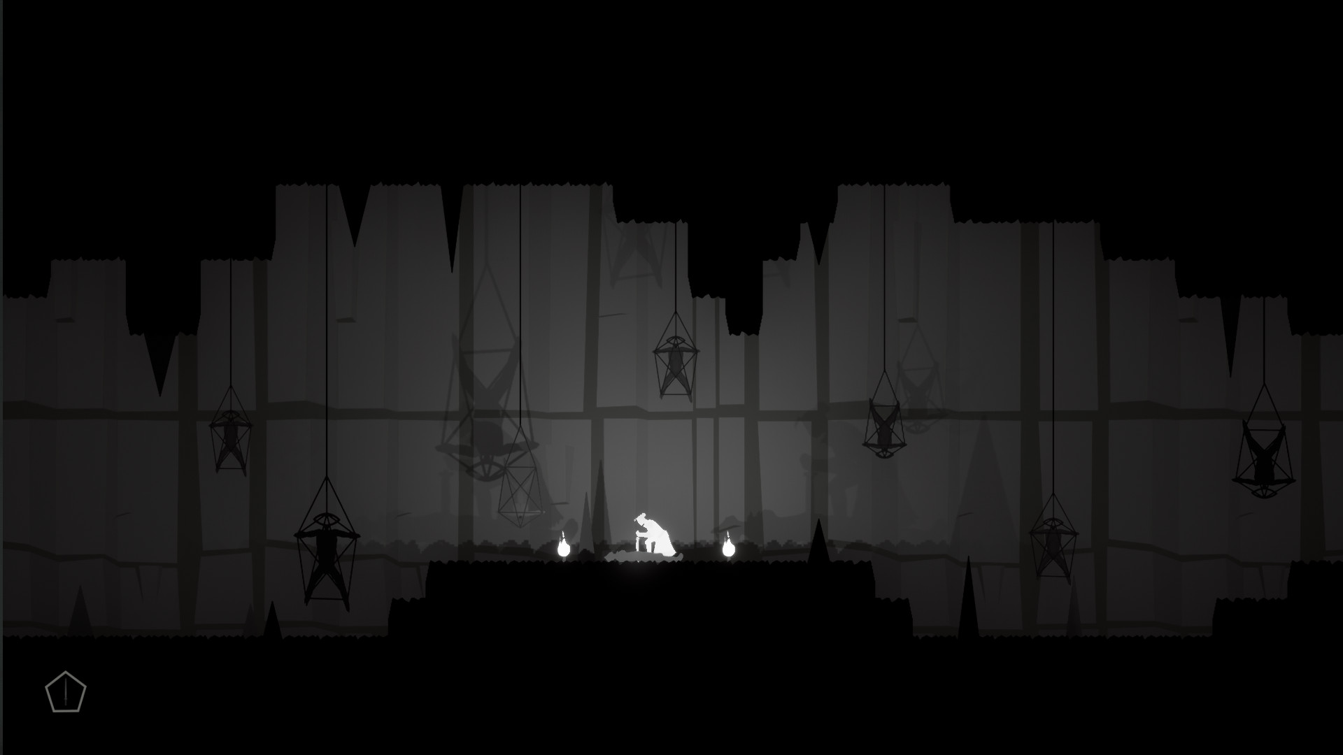
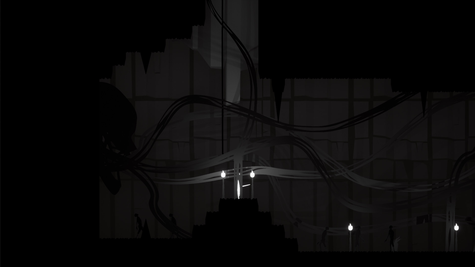
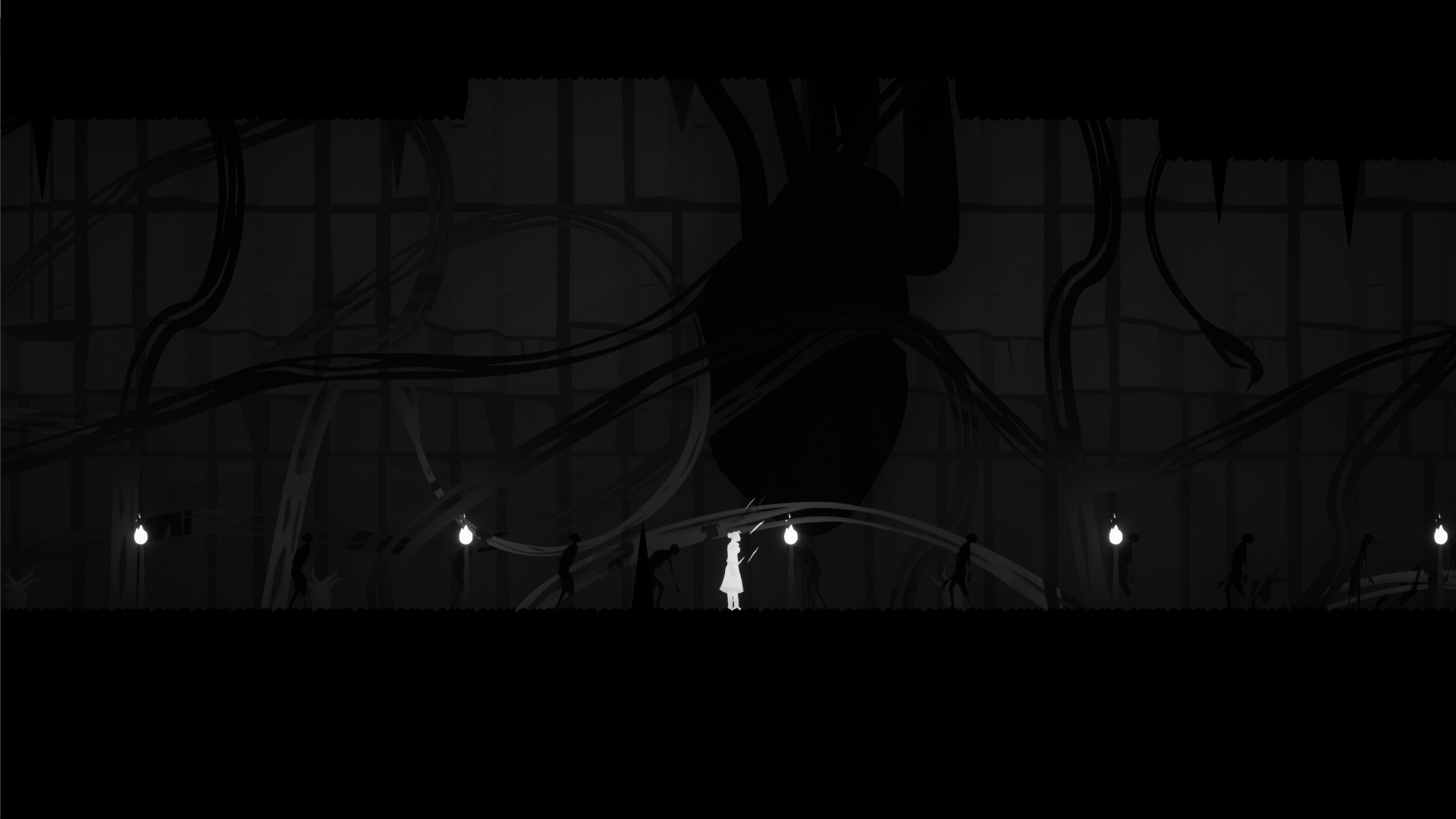
That Abysmal Place is a 2D horror roguelite currently very early in development. The following is a devlog to show the progress made during the r/SoloDevelopment Marathon Jam, which ran from 25th June to 25th July 2021.
A brief history of That Abysmal Place
- Early 2020 - That Abysmal Place starts life as a multiplayer and 2D level generator tech demo. The progress is good, but it is promptly forgotten about for a few months.
- Late 2020 - Tytan, the sole developer (me!), begins streaming and taking part in a few game jams as a way to boost motivation. Shortly after, he discovers and joins the r/SoloDevelopment community.
- Early 2021 - Progress starts on That Abysmal Place again. At some point it was decided that a “Movement and Combat” demo would be released early in order to garner feedback on the… movement and combat. This new level is also intended to function as the tutorial in the full game.
- 25th June 2021 - The r/SoloDevelopment Marathon Jam begins…
The jam goals
The marathon jam provided an ideal opportunity to finish and release the Movement and Combat demo. As such, the goal was simple - to complete the demo to a polished enough state that it could be released on itch.io for people to try. While production on the demo had already started, there were a number of tasks that needed to be completed:
- Certain game mechanics were very rough (combat in particular) or missing altogether.
- A number of character animations and level assets needed creating.
- Audio was missing in a lot of instances - being a horror game, this was a high priority.
- A huge amount of bug-fixing and polishing was required.
The Progress
Game Mechanics
A number of game mechanics were implemented or polished during the jam, some of which were even conceptualised after the jam had started:
- Ropes - The ropes/climbing mechanic had already been implemented before the jam started, but it needed a lot of tweaking. The concept of the ropes was suggested as a way to make the vertical navigation in the levels more interesting. While the idea was solid, the implementation proved to be… tricky. Of course, once ropes were added the game needed...
- Fall damage - A fairly simple update, if the player falls too far they will take damage :)
- Checkpoints - While the game is a roguelite and will feature permadeath, the demo/tutorial level needed a basic checkpoint system so new players could get to grips with the gameplay. Since these won’t feature in the main game, I decided to make them as simple as possible. As such there is no load/save functionality - when you die it simply fades to black, teleports you to the checkpoint and resurrects you :)
- Doors - basic doors and pressure point triggers were added as a way to make the level design more interesting, as well as a way to prevent the player from completing the level before the final "encounter".
- Death - yes believe it or not, there was no death handler before the jam began.
- Rope bridges - a late addition, but a welcome one.
- Interaction highlight - a subtle glow when the player is near an object they can interact with or an item they can pick up.
- Underwater audio - muffling the ambient sound effects when the player is underwater. This was on my “nice to have” list, but it turns out there was a relatively straightforward way to achieve it.
- Sword stuck in corpse - yes, this is a feature. It was basically more interesting than having the sword just lying on the ground.
- Intro and Outro screens - a simple intro screen to introduce the players to the demo, and an outro screen to act as an “ending”.
- Writhing Thing - yes, the big creature at the end of the demo is called a “Writhing Thing”. It was basically already complete, but I did give it an extra attack to hopefully make it a bit more of a challenge. Also I didn’t have time to add death animations for it so currently it’s immortal… sorry if you tried to kill it, but the demo does tell you to “run” :p
Combat
Getting combat right was the main focus of the demo, and so a large amount of time was dedicated to this.
While combat already existed in the game, it was extremely rough around the edges. The original idea was to have a somewhat slow, melee-based combat system, where attacks could be queued up by pressing the button multiple times (similar to games like Dead Cells). Dodging was also already in the game, and acted as a way to “break” attack chains, but only after the current attack was complete. This turned out to be fairly frustrating as the player could often see an attack coming, but could not dodge it in time.
The concept of moving and stationary attacks was also already present in the game. The idea was that stationary attacks would be faster but weaker, and moving attacks (triggered by pressing the attack button while moving forward) would be slower but stronger. It quickly became obvious that moving attacks also needed to push back the enemy slightly, to avoid the player passing straight through them. However this had the unintended side-effect of making the moving attacks far more effective than their stationary counterparts.
The first update during the jam was to allow dodging to be triggered at any time (albeit with a cooldown between dodges), even in the middle of an attack. I was afraid that it would make combat too easy, but in fact the balance immediately felt better - a single Shambler for example was easy to deal with, while a group of 4 proved to be a much bigger challenge.
When it came to the attacks themselves, the stationary attacks were made faster and stronger compared to the moving ones, while being riskier due to the lack of pushback effect. The final attack in the sequence has a chance for a large knockback (or “launch” as I’ve been referring to it), which makes stationary attacks a good option if you are cornered.
The stunned and launched mechanics were again already in the game prior to the jam, but were also very rough. Essentially, there is a small chance that an attack can temporarily stun the target, and an even smaller chance that it can knock them flying.
A 50% damage bonus was applied to attacks that triggered a stun, essentially making this a “critical” hit. The launch mechanic was also fleshed-out with new animations and sound effects.
The final piece of the puzzle was how to implement a health indicator to tell the player when they need to heal. With every update to the game I have to ask myself a question; “how does this affect the overall experience?”. I decided very early on to make the in-game UI as minimalist as possible to ensure it doesn’t distract from the atmosphere - currently the only UI present is the (basic) inventory, which fades out when not in use. Of course this presented a challenge for the health indicator. The solution was to simply change the player character’s idle animation based on the damage they have taken:
- Light damage - standard idle animation.
- Moderate damage - standard idle animation, but breathing faster.
- Heavy damage - doubled over.
Animations
A large number of player animations needed to be added to the game:
- Launched and stunned animations (see above)
- Transition animations between attacking and idle
- Damage indicator animations and transitions (see above)
- Additional swimming animations (including treading water)
- Improved climbing animation
- Healing animation/particle effect
Note that each player animation requires a corresponding sword animation, so it can be attached to the player (except in instances where the sword is hidden, obviously).
Assets
The level itself was pretty barebones; not only was it missing a number of rooms, the only decorations were the background textures, the torches, the “Guide” statue, and the stalactites/stalagmites (which way around do those go again?).
As such a number of level assets were created:


Audio
Audio was of course hugely important to the game, and a number of sound effects were added:
- Additional audio for player actions, including placing ropes etc.
- Combat audio was significantly beefed up.
- Ambient audio in the level.
- The “Guide” speech - this was by far the most time-consuming as it was produced from scratch (most other audio is courtesy of freesound.org, with a few tweaks as required).
Bug fixes
Finally, a number of bugs were fixed (a few are unfortunately still outstanding, see "Known issues" section on the game page):
- Crouching sprite position incorrect.
- Guide text is buggy.
- Incorrect initial position on ropes.
- Player needs to un-crouch when dropping through platforms.
- Water material needs fixing.
- Player character at incorrect angle after climbing/swimming.
- Bubbles spawning above the water surface.
- Blood splatter going in the wrong direction.
- Player is able to attack while crouched.
Other things
Of course, there were certain… “other” things which were added to the game that I can’t talk about. It won’t let me. Perhaps you can try playing the demo again and seeing if anything is different?
Get That Abysmal Place
That Abysmal Place
A nightmarish 2D roguelite that will leave you questioning your sanity.
| Status | Released |
| Author | BlackVoidMedia |
| Genre | Action |
| Tags | 2D, Atmospheric, Exploration, Horror, Lovecraftian Horror, Procedural Generation, Psychological Horror, Roguelite, Surreal, Unreal Engine |
| Languages | English |
More posts
- Marathon Jam - April 2022Apr 23, 2022
- That Abysmal Place - Movement and Combat Demo version 0.3.1 released!Oct 28, 2021
- Linux test builds addedAug 14, 2021


Leave a comment
Log in with itch.io to leave a comment.